BACKGROUND
Storage administrators monitor large volumes of data across locations, systems, pools, and volumes.
Clarity across complex storage infrastructure.
Strata is an enterprise storage dashboard concept that helps administrators spot capacity risks, understand the resources involved, and review an expansion before requesting approval.
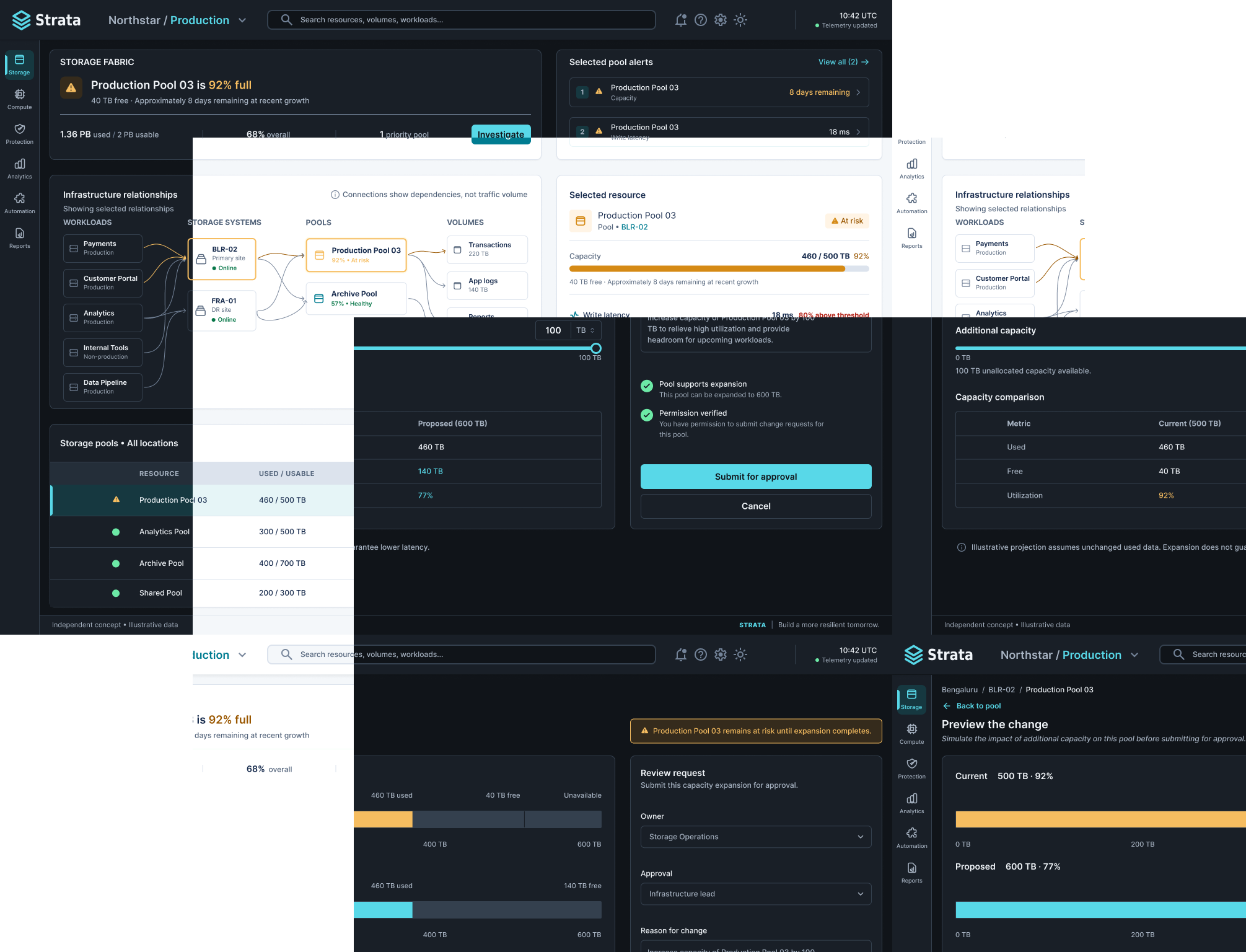
Storage administrators monitor large volumes of data across locations, systems, pools, and volumes.
A healthy overall utilization figure can hide a pool approaching its limit. The highest-priority issue needs to remain visible alongside its context.
Help users answer: What needs attention? Where is the issue? What should I do next?
Make the highest-priority issue immediately visible while preserving the detailed context needed to investigate it.
Designed to make the highest-priority storage risk recognizable at a glance.
A storage administrator responsible for capacity monitoring and infrastructure availability.
Overall utilization is 68% (1.36 PB used / 2 PB total), but Production Pool 03 is 92% full: 460 TB used / 500 TB total. Its 40 TB remaining is estimated to last eight days at 5 TB/day.
Monitor → Investigate → Review
Identify Production Pool 03 as the priority issue.
Inspect utilization, growth, volumes, and write latency.
Preview adding 100 TB and compare current versus proposed capacity.
Submit for approval is the intended next step in the product. Approval submission and confirmation are outside this prototype’s scope; the prototype does not provision storage.
A clear headline surfaces the most urgent capacity issue before supporting metrics.
A connected infrastructure view shows where the affected pool sits within the storage environment.
Users move from overview into pool and volume details without losing their location in the hierarchy.
Capacity, growth, and performance support investigation together. Elevated latency is not automatically attributed to capacity usage.
REVIEW BEFORE SUBMISSION
A capacity preview explains the proposed change before the intended approval step.
Storage is the active workspace in this prototype. Information moves from an environment-wide overview to a selected pool, then to a capacity-change review. The same global navigation remains available throughout.
Resource hierarchy: Organization → Location → Storage system → Pool → Volume. Workloads are related consumers of storage, rather than another containment level.
All three screens use the same slim global navigation. Pool Investigation’s resource tree is a separate, page-level resource browser. The horizontal relationship strip is a simplified summary of dependencies and storage relationships, not a sequential processing pipeline or a visualization of measured traffic.
I focused the prototype on three decisions: what needs attention, what is contributing to the capacity risk, and what a proposed expansion would change. Separating these decisions keeps the overview scannable while revealing detail when it becomes relevant.
Storage Overview → Pool Investigation → Capacity Expansion Review
This is a focused workflow, not the complete storage-management application.
Shared color variables, text styles, spacing values, and reusable button states support consistency across the Light and Dark screens.
These are design-system examples, not a finished application. The Figma setup uses separate Light and Dark collections and themed components.
action/primary
background/canvas
background/surface
text/primary
| Token | Light | Dark |
|---|---|---|
| background/canvas | #F4F7FA | #101419 |
| background/surface | #FFFFFF | #191F27 |
| background/hover | #EEF3F7 | #242E39 |
| background/selected | #E6F5F7 | #163840 |
| text/primary | #172B4D | #F1F5F9 |
| text/secondary | #52637A | #A7B3C2 |
| text/disabled | #7A889D | #7B8796 |
| border/subtle | #DCE3ED | #34404E |
| border/control | #7A889D | #738398 |
| action/primary | #007C91 | #58D8E8 |
| action/hover | #006577 | #80E4EF |
| action/pressed | #005361 | #32BECE |
| action/on-primary | #FFFFFF | #101419 |
| action/disabled | #E4E9EF | #303A46 |
| focus/ring | #007C91 | #58D8E8 |
| status/success/text | #067647 | #6CE9A6 |
| status/success/background | #ECFDF3 | #15382A |
| status/warning/text | #9A5700 | #F6BD60 |
| status/warning/background | #FFF4E5 | #352B1C |
| status/error/text | #B42318 | #FF7979 |
| status/error/background | #FEF3F2 | #3C2226 |
Letter spacing: 0%
Spacing: 4, 8, 12, 16, 24, 32, 48 px
Control radius: 6 px · Container radius: 8 px · Control height: 40 px
Default table row: 44 px · Compact table row: 36 px
Standard icon: 20 px · Default border: 1 px · Focus indicator: 2 px
Static specimens show the visual states. Disabled and loading examples do not trigger actions.
Make urgent storage risks easier to recognize and support a clear path from investigation to an informed request.
These are planned checks. The concept has not yet been validated with users.
Interactive concept covering storage monitoring, pool investigation, expansion review, and Light/Dark switching. Approval submission and confirmation are outside this prototype’s scope.
Switching themes preserves the current screen and selected-pool context. The prototype navigates between corresponding Light and Dark frames.
The design centers on a clear path from recognizing a capacity risk to reviewing an informed request.
User validation is the next step for this independent concept.
Priyanka Kumari
Senior UX / Product Designer
portfolioprishu.netlify.app