Find the right work
Make region, sentiment and priority visible before opening a conversation.
From global conversations to considered responses.
Relay brings regional social conversations into one focused workspace. I designed a three-screen journey to help teams prioritize issues and prepare AI-assisted responses while keeping final decisions human-led.
Social conversations arrive through different channels and markets, but responding well requires more than spotting a negative comment. Teams need to understand the issue, see any earlier contact and choose an appropriate next step.
Relay connects a global overview, a filtered conversation queue and a focused conversation detail view. The concept uses a chocolate brand across the US, UK and Europe, with Europe treated as excluding the UK to avoid overlapping regional totals.
The design challenge was to make a large conversation space manageable without losing the context behind each customer issue. A regional overview alone cannot support a response, while showing every message and action at once makes prioritization harder.
Make region, sentiment and priority visible before opening a conversation.
Keep public comments and related private messages distinguishable but connected.
Treat AI output as a draft and make uncertainty visible before sending.
Scan incoming conversations, filter relevant work, read the source messages, prepare a reply and escalate when needed.
Review conversations that need attention, adjust ownership and support escalations.
A three-step progression guides community managers from broad regional metrics to focused response preparation:
Choose the market that needs attention.
Filter by sentiment and open a relevant conversation.
Read the source, review AI assistance and prepare a reply.
Region and sentiment provide the context for the list. Returning from a conversation should preserve the queue's filters and position. Exceptional is an independent flag that can overlap positive, negative or neutral sentiment.
An earlier layout included a conversation list, full thread and reply composer on the second screen, followed by another response-review screen. This repeated the task and made the transition between screens less clear.
I revised the structure so that the second screen is dedicated to browsing conversations and the third contains the selected thread and response tools. This gives each screen a clear purpose and makes the next action easier to explain.
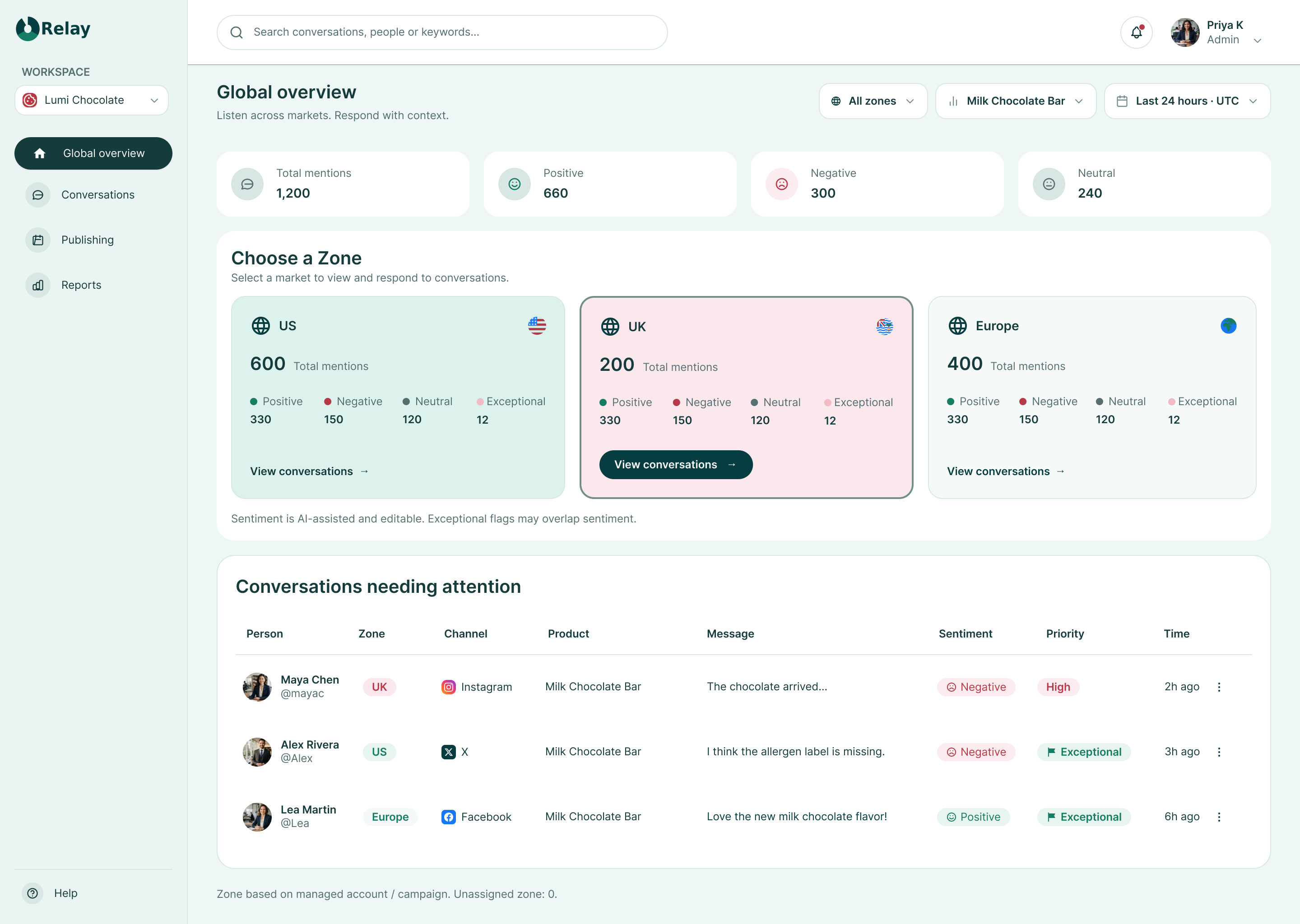
The overview brings total mentions, sentiment summaries and regional entry points into one starting view. A separate attention table surfaces individual conversations that may need a closer look.
Regional cards create clear entry points into market-specific conversations.
Positive, negative and neutral labels make sentiment understandable beyond color.
The attention table connects the summary view to individual customer issues.
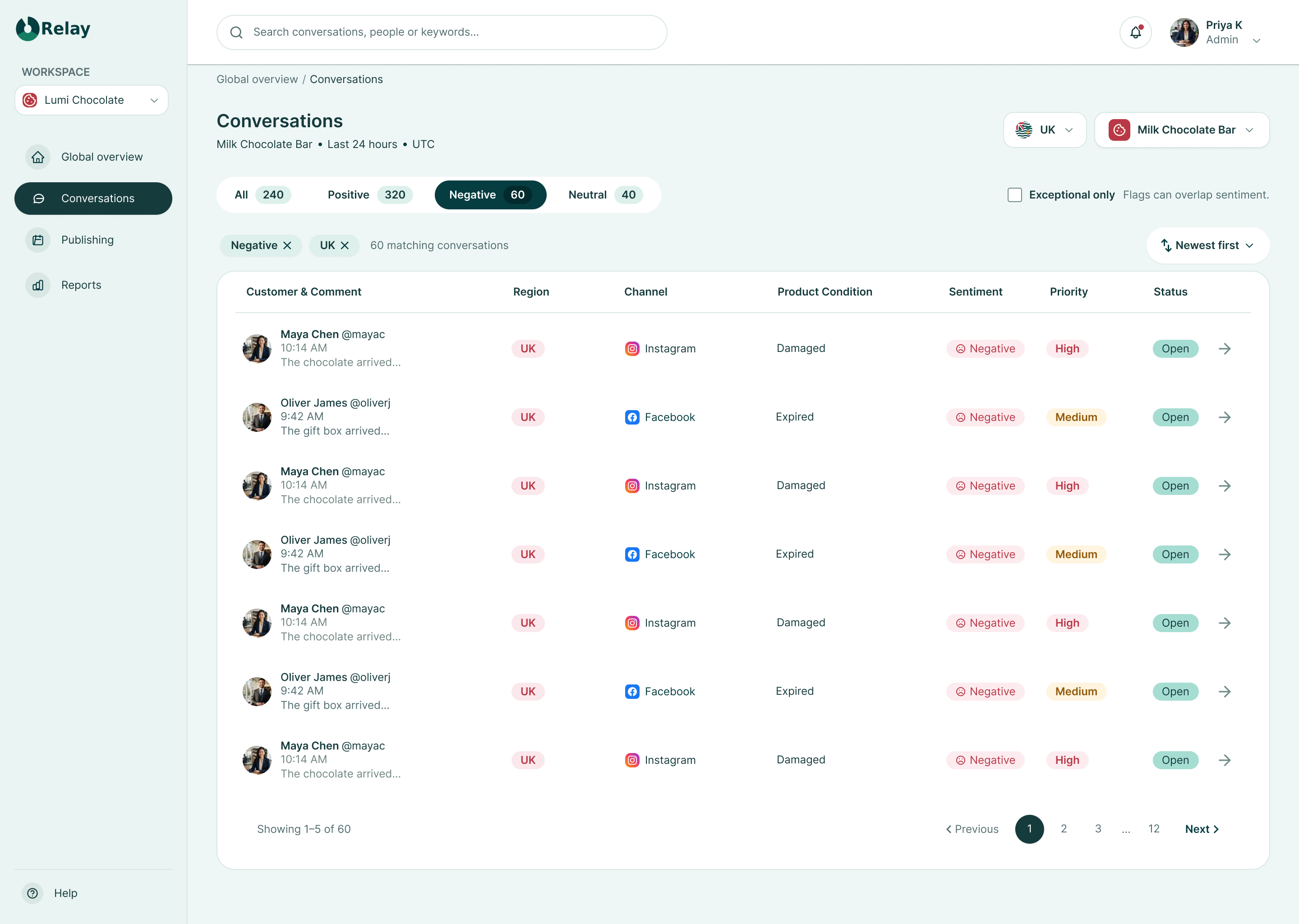
The queue turns the selected region into a focused list of customer comments. Sentiment tabs, filter chips and row-level details help the user compare issues before opening one conversation.
Visible UK and Negative filters explain why these conversations are in the list.
Channel, product condition, sentiment, priority and status support triage.
A row action provides a direct transition into the selected conversation.
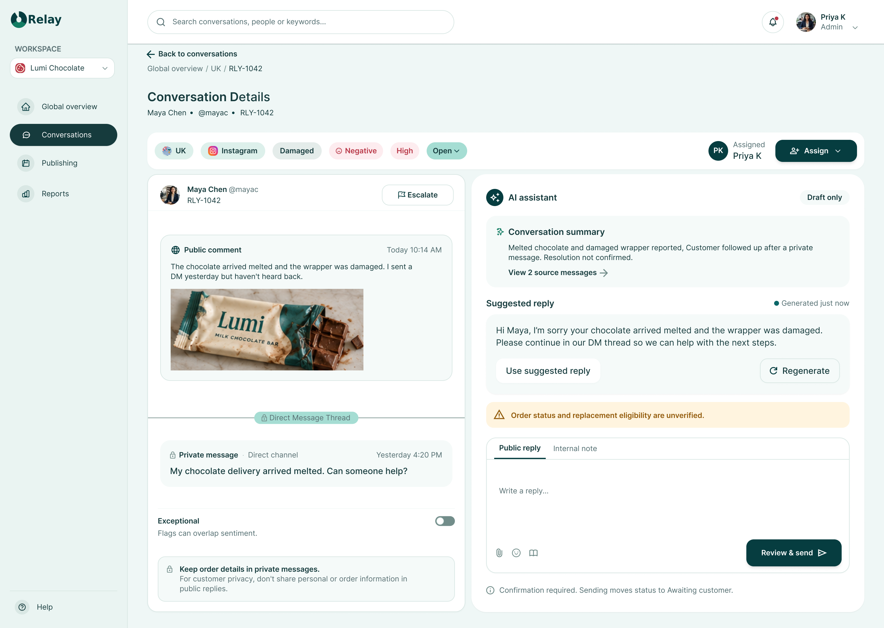
The detail view brings the public comment and related private message together while keeping their visibility clearly labeled. Alongside the source conversation, the AI assistant summarizes the issue and suggests a reply. A separate composer gives the user a place to prepare the final response.
The source conversation stays visible beside AI assistance so the suggestion can be checked against the original messages.
Draft-only labeling and an explicit warning identify the limits of the available information.
Assignment, escalation and a review-before-send action support a deliberate next step.
Relay incorporates artificial intelligence to streamline repetitive analysis while keeping human decision-makers accountable:
Keep the original conversation available for comparison with the AI summary.
Present AI text as draft content that the user can review before preparing the reply.
The interface warns that order status and replacement eligibility are unverified.
Public replies should avoid personal and order information; sensitive details belong in the private thread.
The intended send flow includes confirmation and moves the conversation to Awaiting customer rather than automatically marking it resolved.
A light mint canvas and white content surfaces keep the workspace calm, while deep teal anchors navigation and primary actions. Semantic colors are paired with text labels so that meaning does not rely on color alone. Inter provides a consistent hierarchy for dashboard labels, conversation content and metadata.
Font Family
Inter maintains clarity, legibility and contrast across high-density social listening queues and conversational details.
#EFF7F6#EFF7F6#EAF4F2#EAF4F2#FFFFFF#FFFFFF#F5FAF9#F5FAF9#163B3D#163B3D#526D70#526D70#586F72#586F72#FFFFFF#FFFFFF#063D40#063D40#0B5052#0B5052#032B2D#032B2D#0B6768#0B6768#DDF0EB#DDF0EB#063D40#063D40#063D40#063D40#DDF0EB#DDF0EB#D9E7E4#D9E7E4#728D8A#728D8Argba(6,61,64,0.24)rgba(6,61,64,0.24)#147D64#147D64#E8F5EF#E8F5EF#925A0A#925A0A#FFF4DF#FFF4DF#B93848#B93848#FDECEF#FDECEF#E4ECEA#E4ECEA#718682#718682#A5DDD3#A5DDD3#F2BAC3#F2BAC3#DDF2ED#DDF2ED#FBE8EC#FBE8EC#F5FAF9#F5FAF9Spacing steps: 4 / 8 / 12 / 16 / 24 / 32 / 48px · Content gaps: 16 / 24px · Card radius: 20px · Container radius: 24px · Control radius: 12px · Intended control height: 44px · Subtle shadow: 0 4px 16px rgba(6,61,64,0.04).
The concept uses labeled status and sentiment indicators, a consistent type hierarchy and distinct public/private message labels. The next implementation pass should verify keyboard navigation, focus visibility, contrast in the final rendered components, target sizes and zoom behavior. This is not a completed accessibility audit.
Experience the complete three-screen workflow from global overview through regional prioritization to response preparation.
View Interactive Prototype ↗The current outcome is a three-screen design concept with a clear progression from regional overview to conversation review. Its main contribution is the separation of prioritization and response preparation, supported by AI assistance that remains visibly subordinate to human judgment.
Complete and validate the prototype interactions, test whether users can locate a relevant issue and prepare an appropriate response, and refine empty, loading, error, escalation and post-send states.
Designing Relay reinforced the value of giving each screen one clear responsibility. AI becomes more useful when the source context, uncertainty and final user action remain easy to understand.
Follow the journey from a regional signal to a considered customer response.