Identify a flow in the Amazon mobile app that requires improvement and redesign the experience.
Scope
I focused on three high-impact interactions within the existing product purchase flow:
Review access
Purchase actions during scrolling
Checkout completion
Why this flow?
These interactions directly affect trust, purchase intent, and conversion on mobile devices.
Design Goal
Create a product detail experience that helps users answer “Can I trust this?” and “Can I buy this now?” within the first few interactions.
Current Experience Audit
During a walkthrough of the Amazon India mobile app, I observed three friction points:
Review Discoverability
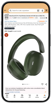
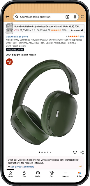
The review entry point is placed near the brand and product metadata, making it less prominent during quick scanning.
UX Rule Affected: Recognition over Recall
Purchase Accessibility
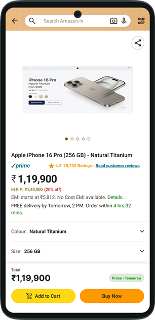
After users scroll through offers, specifications, and content sections, Add to Cart and Buy Now are no longer visible.
UX Rule Affected: Fitts’s Law
Checkout Complexity
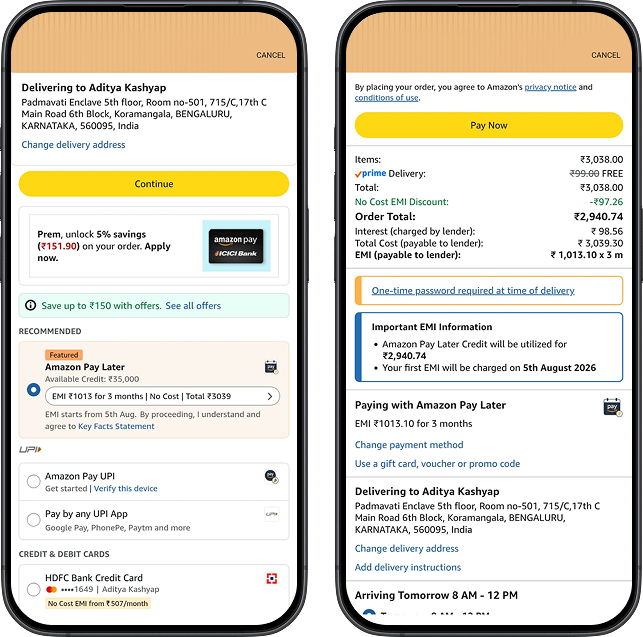
Users move through multiple screens for address confirmation and payment selection, increasing step count and context switching.
UX Rules Affected:
Hick’s Law
Visibility of System Status
Recognition over Recall
User Problem Statement
Amazon India’s mobile checkout journey creates unnecessary interaction cost by separating trust validation, purchase actions, and payment completion across multiple screens and distant touch targets.
User Impact
Extra scrolling to find reviews
Loss of purchase context
Repeated confirmation steps
Increased thumb movement
Unclear completion state before payment
Design Goal
Help users:
Validate trust quickly
Purchase from anywhere on the page
Complete payment from a single scannable screen
Heuristic Evaluation
Interaction
Current Experience
UX Rule Affected
Design Direction
Review Discoverability
Review entry is grouped with brand metadata and is not visually prominent.
Recognition over Recall Visual Hierarchy Information Scent
Provide a dedicated, consistent review action.
Purchase Accessibility
Add to Cart and Buy Now disappear while users explore the page.
Fitts’s Law Thumb-Zone Optimization Efficiency of Use
Keep primary purchase actions visible while scrolling.
Checkout Completion
Address and payment confirmation are split across multiple screens.
Hick’s Law Visibility of System Status Recognition over Recall
Combine required choices in one scannable checkout view.
The Solution
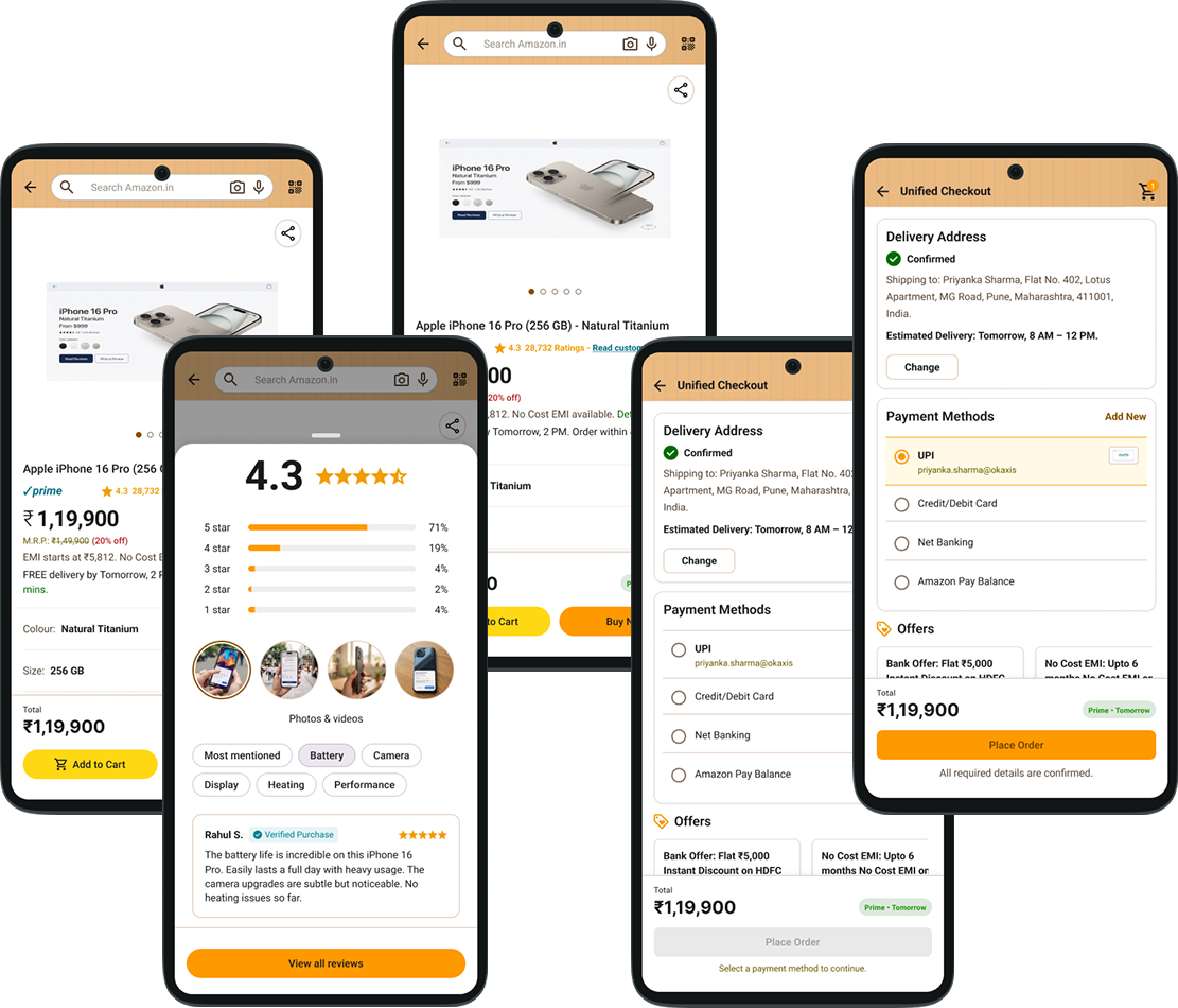
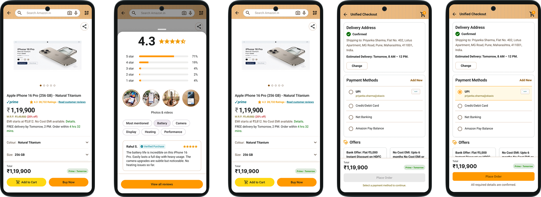
The redesigned journey focuses on three connected improvements:
Making reviews easier to discoverKeeping purchase actions accessible while scrollingSimplifying checkout into a single bottom-driven flow
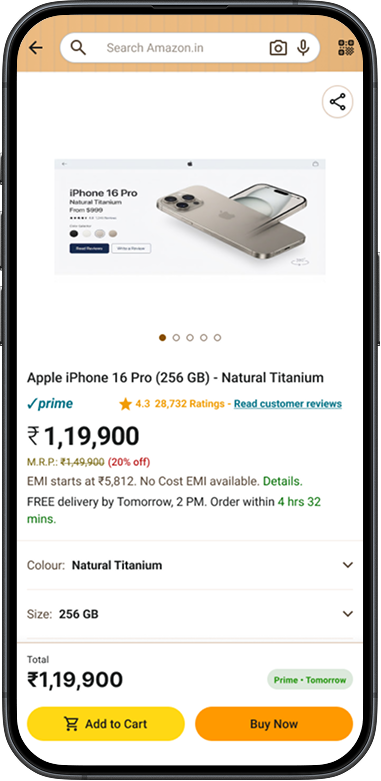
Screen 1 — Product Detail Page with Clear Review Access
Current Issue — What I observed
Review entry is grouped with brand metadata
Review action is not visually prominent
Add to Cart disappears while scrolling
Users lose quick purchase access during exploration
Proposed Resolution — Design Changes
Added a dedicated Read Product Reviews CTA
Separated review access from brand information
UX Rules Affected
Recognition over Recall
Visual Hierarchy
Fitts’s Law
Expected Outcome
Faster trust validation
Reduced scrolling effort
Continuous purchase access
Better one-handed usability
Product Detail Page with Clear Review Access — Before vs. After
Before
After
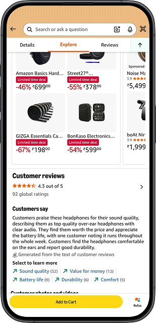
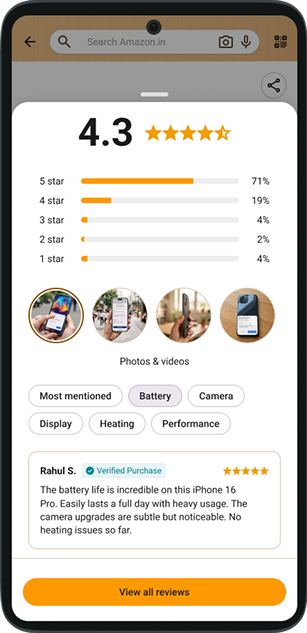
Screen 2 — Review Discoverability
Why users struggle to access product reviews quickly on Amazon India
Current Issue — What I observed
Rating is grouped with brand metadata
Review action is not visually prominent
Users often scroll further to find detailed reviews
Proposed Resolution — Design Changes
Added a dedicated Read Product Reviews CTA
Separated review access from brand information
Introduced a clear, consistent tap target
UX Rules Affected
Recognition over Recall
Visual Hierarchy
Information Scent
Expected Outcome
Faster trust validation
Reduced scrolling effort
More discoverable review access
Review Discoverability — Before vs. After
Before
After
POV: The redesign improves the discoverability of the review action, which is the actual friction point.
Screen 3 — Persistent Purchase Actions
Current Issue — What I observed
Add to Cart disappears while scrolling
Users must scroll back to purchase
High-intent users lose action access during exploration
Proposed Resolution — Design Changes
Added a sticky bottom purchase bar
Kept Add to Cart and Buy Now visible during scrolling
Surfaced price and delivery context continuously
UX Rules Affected
Fitts’s Law
Thumb-Zone Optimization
Efficiency of Use
Expected Outcome
Faster purchase access
Reduced interaction cost
Better one-handed usability
Persistent Purchase Actions — Before vs. After
Before
After
Purchase intent should never be blocked by page depth.
Screen 4 — Unified Checkout
Why the current checkout flow feels heavier than necessary.
Current Issue — What I observed
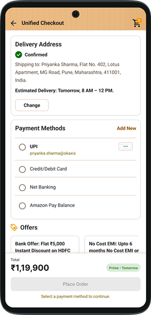
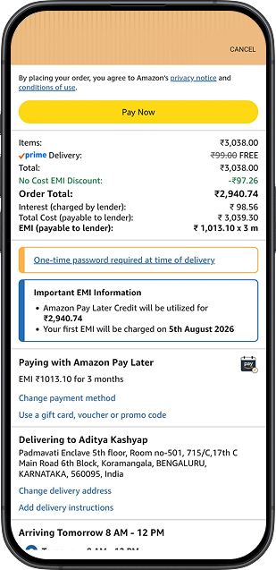
Address confirmation and payment confirmation are split across two screens.
The same information is repeated in both steps.
The primary CTA appears at the top in both screens.
Users must switch context before reaching the final payment action.
Proposed Resolution — Design Changes
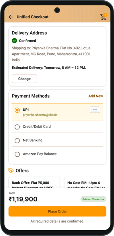
Combined address and payment selection into a single checkout screen.
Kept the address section at the top with Change / Add New Address actions.
Displayed all payment methods on the same screen.
Added a bottom sticky “Place Order” button.
UX Rules Affected
Hick’s Law — Extra sequential decisions
Recognition over Recall — Repeated information processing
Visibility of System Status — Unclear completion state
Fitts’s Law — CTA placed outside the natural thumb zone
Expected Outcome
Fewer navigation steps
Clear completion logic
Reduced cognitive load
Faster one-handed checkout
Unified Checkout — Before vs. After
Before
After
Address and payment are completed in a single view, and the final action becomes available only when all required inputs are selected.
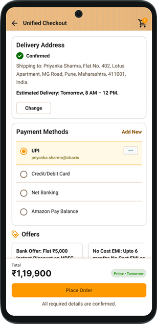
Screen 5 — Ready for Payment
Final checkout state after address and payment are successfully selected
Changes from Screen 4
Address
Selected and confirmed
Default address displayed
Change / Add New Address remains available
Payment Method
Selected and confirmed
Chosen payment method highlighted
Other methods remain editable
CTA State
Place Order / Pay Now becomes active
Amazon primary color
Full-width sticky bottom placement
High-contrast visual emphasis
Ready for Payment — Before vs. After
Before
After
Design System & UI Library
Color System
Brand Colors
Amazon Yellow#FFB703
Orange#F7A500
Text Colors
Primary Text#111111
Secondary Text#666666
Disabled Text#9E9E9E
Neutral Colors
Surface#FFFFFF
Background#F7F7F8
Divider / Border#E5E5E5
Disabled Surface#CFCFCF
State Colors
Selected Payment Background#FFF7E6
Selected Payment Border#F7A500
Active CTA#FFB703
Disabled CTA#CFCFCF
Semantic Colors
Success#008A00
Warning#F59E0B
Typography System
Roboto
Titles
Page Title24px / Bold
Section Title18px / SemiBold
Card Title16px / SemiBold
Body
Primary Text16px / Regular
Secondary Text14px / Regular
Caption12px / Regular
Commerce
Product Price20px / Bold
Offer Text14px / Medium
Status Label12px / Medium
Controls
Button16px / SemiBold
Input Label14px / Medium
Link Text14px / Medium
Reusable Components
Buttons & States
Primary actions
Secondary & tertiary
States
EnabledDisabledSelected
Chips & Cards
Chips
Most mentionedBatteryCameraDisplayHeatingPerformanceVerified Purchase
Cards
Product card
Review summary
Customer review
Delivery Address
Payment Methods
Order Summary
Spacing & Layout
Base Unit8px
Spacing Scale
XS · 4px
S · 8px
M · 16px
L · 24px
XL · 32px
Layout
Screen Padding
16px
Card Padding
16px
Section Gap
24px
Sticky Bottom Bar
72px
Touch Targets
Buttons
48px
Icons
24px
Final Prototype — Friction-Reduced Trust-to-Checkout Flow
End-to-end Amazon India mobile redesign from trust validation to payment completion